Should Developers be involved in UI/UX?
Identifying some often overlooked pitfalls when chopping design into code
A couple of weeks ago, Bonzai designer Mayra Pulido posted a thought provoking article Should UI Designers do UX?. My thoughts being sufficiently provoked, I started thinking about developers being involved in the ;UI/UX process.
I’ve been a web developer for many years now. I’m also terrible at design. If I sat down in front of a blank Illustrator file and tried to make a beautiful website, we would all be very sad. There are so many amazing designers in the world, I leave the design to them. I turn the design into code.
But designers also live in a nice world where they have control over every aspect of what they see. The designs look really nice, but can sometimes fall apart when it comes time to turn into dirty HTML.
I’ve outlined a few common scenarios I’ve encountered over the years.
The Mystery of the Gratuitous Design Elements
Whenever possible, wireframes should be done before the actual design. Wireframes are great because everything serves a purpose. Everything exists in the wireframe because it needs to do something. A button gets clicked, a label displays data, etc.
Sometimes a designer will grab a wireframe and add extra elements to make it look better. Common examples would be arrows or plus signs. Consider this example:
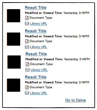
This is a wireframe for a document list that we added to our Bonzai Intranet. Looks pretty simple. A list of documents with modified date, document type, a link to the document, etc. I would guess that the black boxes are some kind of thumbnail. Can’t wait for the design to show up!

Well now we’ve got a bit of a pickle. The obvious concern is the inclusion of the profile photos. Do we actually have access to the photos? Do we now need to import the photos along with the documents? Are there any performance implications?
The other concern is the collapsing and displaying of the additional data. This is pretty simple javascript functionality, but there are some concerns. Does the client actually want the data hidden? Maybe they want it displayed all the time. Maybe the designer collapsed the data so that this would fit on a page with other elements? Did they plan for a situation where all the items are expanded? Maybe that will break the layout.
Without the wireframes, I would have to blindly accept the design and write the code based on that. However, when I have wireframes to compare to, I can see what is most important and discuss with the designer potential issues with the design.
The Case of The Undersized Lipsum
This one is very common. Let’s look at the design of the Bonzai Locations Directory, for example.
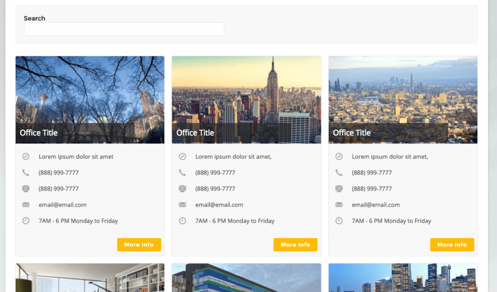
This is a lovely design. Everything is inline and very symmetrical. But let’s see what happens when we add some real life data:

You can immediately see the issue. The Vancouver address is on 2 lines, and the Mexico City address is on 3 lines, plus their hours is also on 3 lines. The designer didn’t factor in the variable height, so the bottom of the items don’t line up anymore.
There are several ways this could be addressed. We ended up calculating the height of the tallest “inner content” per row and setting a fixed height of all the content on that row.
That’s better. Now the elements line up and the designer can sleep at night.
The Secret of the Forgotten Form Functionality
Forms are wonderful things. Forms allow the users to pass data into the website. Without form the web would just static blocks of text. Not really true, but forms are great. But forms are also very complicated. They have user input concerns, required field labels, etc. Lets look at this example I found on the internet:

As a developer, I look at this form and cringe. This is a form for lead generation, which means all the fields, or at the very least the email address field will be required. So the user hits the “Download Now” button and this happens:

All the required field labels pop in, and now the form is spilling out of the header. There are a few ways this could be fixed. You could use a larger header image and have the header expand as needed. Or you could use a single “All fields are required” label by the “Download Now” button.
And I would have gotten away with it, if it weren’t for you meddling devs
As you can see, there are many snags that can be hit while converting designs into code. Having your developer involved early on in the process can help identify trouble spots, which will streamline the whole process.

It’s Time To Transform
Let us show you how much easier your work life can be with Bonzai Intranet on your team.